The political machines of the UK are currently in the process of ramping up in preparation for the general election on May 7th. This marks the election of the 56th parliament of the united kingdom, and seems like a good opportunity to take a look at some of the data from previous elections.
Getting the Data
What I first set out to look at past election results in the UK I had assumed that the data would be easy to obtain. Wikipedia contains the overall results of the elections stretching back over nearly 200 years. What it does not contain is the break down of the results on a constituency level, which seems like a more interesting dataset.
My next stop was the electoral commission. They have an excellent break down of elections since 2000, however after a few emails to them it became apparent that they don't hold any results before that.
The only place I could find the results online was Political Science Resources. Here the results were available down to the constituency level, but not in an easy to access format. I had to do some web scrapping, but the consistent format meant that a short python script, available here, allowed me to grab the data and save it in JSON format. The resulting data can be found here, and covers the general elections since 1950.
- The data covers 17 general elections, spanning the last 60 years.
- In these elections almost 5 billion votes were cast, with over ten thousand MPs being elected.
- almost 668 Political parties took part (this is an over-count obscured by the fact that the same party might be have it's name recorded slightly differently, e.g. 'LibDem' and 'Liberal Democrat'). This includes a number of uncommon names such as 'Death Dungeons & Taxes' Party.
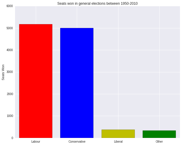
How did it go for the parties involved? The total number of seats in parliament won by each party can be found below
As you can see, the British system is dominated by two parties: Labour and Conservatives. In far third place are the Liberals (Here I follow wikipedia's lead use the label "Liberal" to cover the Liberals, the SDP–Liberal Alliance and the Liberal Democrats). Behind that are a series of small parties and independent candidates labelled "other". I will use this convention in the following. Some of the time my numbers show and off-by-one error with respect reports elsewhere. As far as I can tell this is due to the inclusions of the Speaker - who in my data is not considered to have a party and so gets lumped in "other".
Looking at the Data
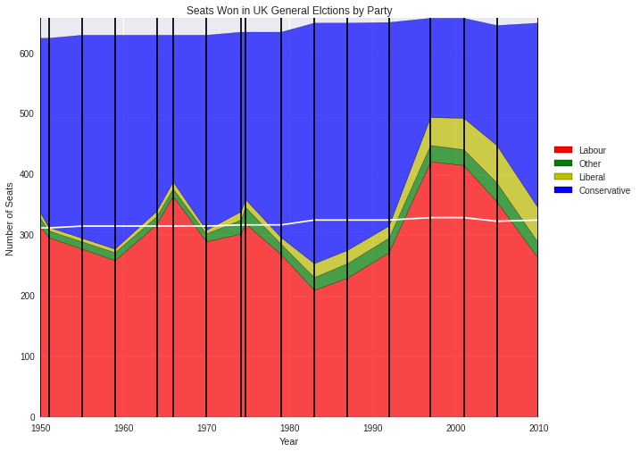
We've just seen a total summary of the vote - how does this share of seat won by each party changes over time?
The vertical black lines show when an election took place, and the white line shows half the total number of available seats.
Notice that the total number of seat available changes over time. This happens whenever there are boundary changes for constituencies. The process is designed to take into account population shifts over time and to keep it so that each MP represents roughly the same number of people.
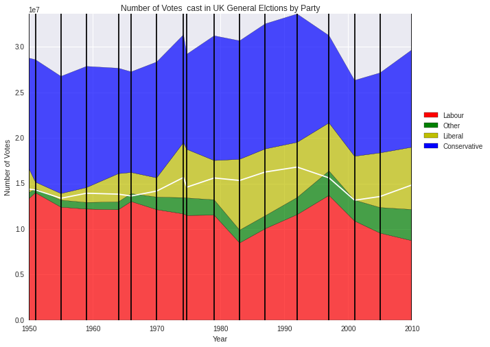
Over the same range we can look at the total share of each vote the parties won
Where the style is the same as the previous graph.
Ignoring the full results themselves and focusing only on the total number of votes cast we see a steady rise over time until 1992, then a drop. This means that despite the total population of the country increasing by 5 million between 1992 and 2010, the total number of people voting in these elections fell by almost 5 million. Let's take a look at this in more detail.
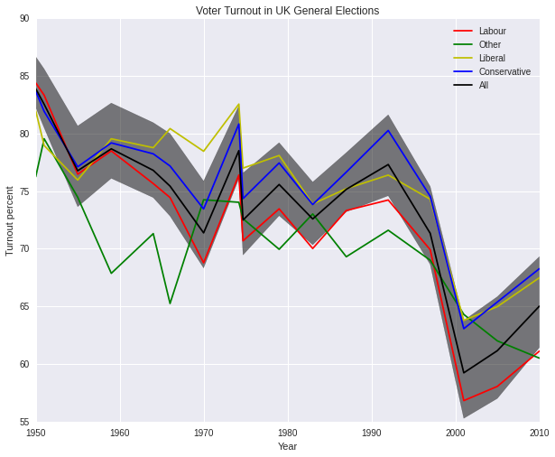
How does the percentage turnout vary over time?
Here the black line represents the mean turnout for each constituency for a given year, and the black shaded area around this line shows the a fifty percent range - that means that the turnout for half the constituencies of that year lie in that range. I was curious to see if the winner party had any effect on the turn out, so I plotted the lines representing the mean turnout each year for each of the parties separately. These are the coloured lines on the graph.
However you look at it the turnout rate is dropping - this is true for every party. It seems to be true for most countries as well.
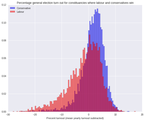
Looking at the graph it might be possible to say that the turnout for constituencies where Conservatives and Liberals win is slightly higher than for constituencies where the Labour win. To investigate this further, let's look at just the constituencies where Labour and Conservatives win seats. Because of the large variation on turnout due to time, I am going to subtract off the mean turnout for each year from the results. A histogram of the remaining turnout is shown below.
That looks fairly conclusive: on average the areas that return Conservative MPs have a higher turn out than those that vote Labour.
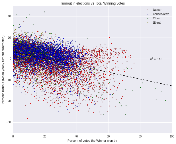
I have a feeling that this difference could be due to how closely fought an election was. I can imaging a situation where the turnout of an area is lower than average if it is expected beforehand that one party or candidate is going to win the election by a long way. While the data does not allow me to directly measure this feeling, I can try and get a proxy for it by looking at the number of votes the winning candidate won by, as a percentage of the total number of voters.
To do this, I am going to look at every election and collect both the fraction of the votes the winner received, and the percentage turnout for the election. Again I am going to subtract off the mean turnout for that year from each of the elections.
Here every data point represents the result of a single election in a single constituency in a single year.
Fitting a straight line to the data results in the black line over the top of the data points, with the form of the fit and R squared value quoted on the graph. There is some sort of general pattern there - when the winning candidate gets more votes the turnout is on average lower, but the low \(R^{2}\) value suggests that only 16% of the variance in the turnout can be explained this way.
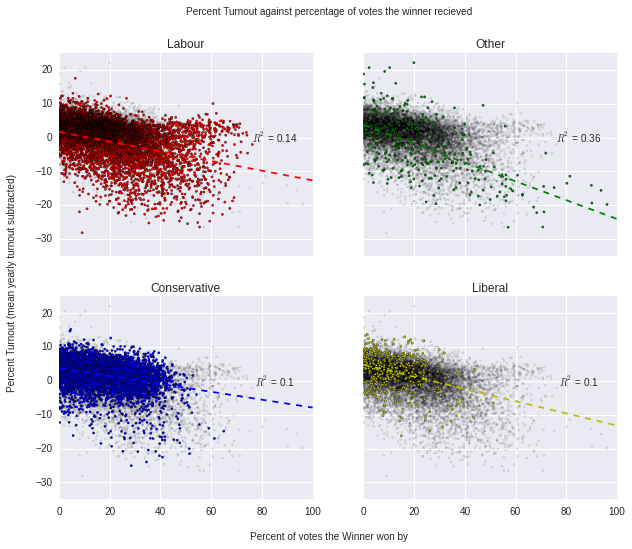
The above graph hints that there may be a difference between the parties, but does not make it clear. Let's look at each party in turn and see how they fit into the overall pattern.
Where each square shows has the results for a different party highlighted - the results for the other parties have had their transparency reduced.
This is interesting: different parties show different shapes. Qualitatively we can note the following
- Roughly each party shows some trend of the form: the higher the winning fraction, the lower the turnout.
- Compared to the Conservatives, Labour has more scatter in their points. It has more areas where the turn out is lower and more areas where they win by a long way - but these are not necessarily the same areas.
- Compared to Labour and Conservatives, the areas where Liberals win tend to have a higher turnout, and the election is closer.
- The parties in "Other" show the strongest correlation between how close the election was and what the turnout was. This could be due to the parties lumped in "Other" often related to local issues - potentially making it more obvious when an election is going to be close - although that is pure speculation.
All of this suggests that the difference in turnout rate between areas that return Conservatives and Labour MPs cannot be explained by just differences in how close the elections are alone (at least when assuming a naive linear model relating the two). These ideas can be made more quantitative by comparing the mean of each distribution before and after adjustment for percentage win - and the result is the same conclusion as above.
In the future I'd like to look at how other factors come into play. It would be interesting to see how results change in regions over time. To do this I'd need to include factors like by elections and how constituency boundaries have changed . Another would be to try and look at how demographics correlate with political party. Hopefully these will be topics for future posts.
How was it made
All graphs were produced in python using matplotlib and its seaborn package.
Comments !